Logo
The Reaction brand is simple, bold and balanced. Our logo represents the structure and constraints of strategic design while emphasizing the importance of thinking outside the box.
Download LogoLogo
Colour
Optical kerning, refined weight, and defined clear space, as well as well-delineated placement in relation to other content all help to make it as instantly recognizable as possible at all sizes and in all contexts.
Use the full-colour logo on white, tan or light coloured backgrounds.
Use the single colour logo on a tan or orange background.
Use the single colour logo in tan on a grey or dark coloured background image.
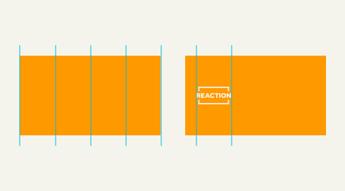
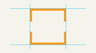
Minimum Size & Clear Space
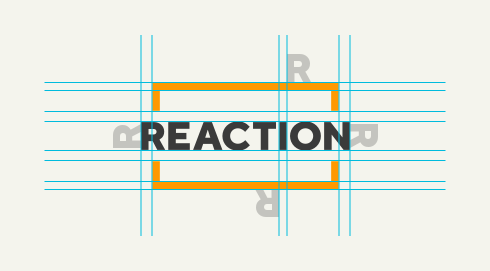
The size of the logo should never be less than 25% of the width of the total canvas. Clear space around the logo is equal to the cap height of the R.
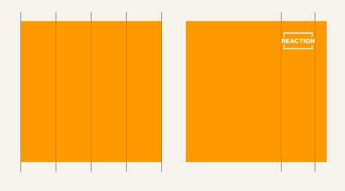
A 16:9 slide with a canvas of 1920px x 1080px. Divide the width by 4 and this is the minimum size the logo should be (1920/4= 480px).
A social post with a canvas of 1080 x 1080px. Divide the width by 4 and this is the minimum size the logo should be (1080/4= 270px).
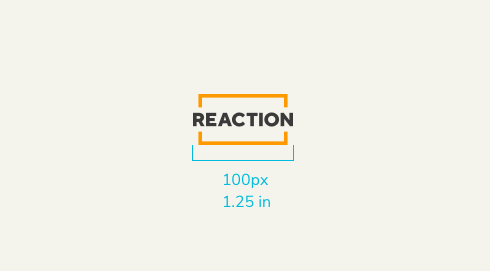
The logo should never be smaller than 100px wide or 1.25” when used in print.
Clear space around the logo is equal to the cap height of the R. The thickness of the brackets is equal to the width of the I.
Incorrect Usage
Never use an all-orange version of the logo.
Never adjust the opacity of the logo.
Never mask the logo with alternate colours.
Never use a dark version of the logo on an orange background.
Never tilt or rotate the logo.
Never stretch, skew or distort the proportions of the logo.
Never place the logo on top of a background pattern.
Never place the logo on top of a busy background image.
Colours
Our primary brand colours are orange and tan. They are used to provide accessibility, simplicity, and consistency throughout all brand communications.
Light Orange, Dark Orange, and Dark Tan can be used as accent colours to create two-tone backgrounds or add shading to illustrated accents.
Primary Colours
Orange
@orange
HEX
FF9900
RGB
255, 153, 0
CMYK
0, 47, 100, 0
PANTONE
144c
Light Orange
@light-orange
HEX
FFAA00
RGB
255, 170, 0
CMYK
0, 38, 100, 0
Dark Orange
@dark-orange
HEX
FF8800
RGB
255, 136, 0
CMYK
0, 57, 100, 0
Tan
@tan
HEX
F4F4ED
RGB
244, 244, 237
CMYK
3, 2, 6, 0
Dark Tan
@dark-tan
HEX
E6E6DB
RGB
230, 230, 219
CMYK
9, 6, 13, 0
Slate Grey
@grey
HEX
333333
RGB
58, 58, 58
CMYK
69, 62, 61, 52
Pop Blue
@blue
HEX
00BBDD
RGB
0, 187, 221
CMYK
70, 2, 10, 0
Secondary Colours
Our secondary colours are intended to be used in documents, reports, and presentations. They should be used sparingly throughout marketing assets in order to maintain the impact and predominance of our primary brand colours.
@Orange
#FF9900
@Orange
#FF9900
@Orange
#FF9900
@Orange
#FF9900
@Orange
#FF9900
@Orange
#FF9900
Client Brand Colours
When sharing work from our portfolio there will be instances when our clients’ primary brand colours will clash with our brand colours. Using the tan background will provide the most flexibility but it’s also okay for our portfolio assets to take on the brand colours of our clients. In these instances, using the single-colour tan version of our logo will be the most complementary to co-brand those assets and in some exceptions, our logo can also be utilized in white.
These guidelines apply when we are co-branding portfolio assets but our logo does not need to be present on all portfolio assets.

Use the full-colour logo on white, tan or light coloured background images.

Use the single colour logo in tan on an range background.

Use the single colour logo in tan on a grey or dark coloured background image.
Typography
Our typography is simple, balanced, and designed to maximize its impact across all applications while keeping it easy to read and highly recognizable.
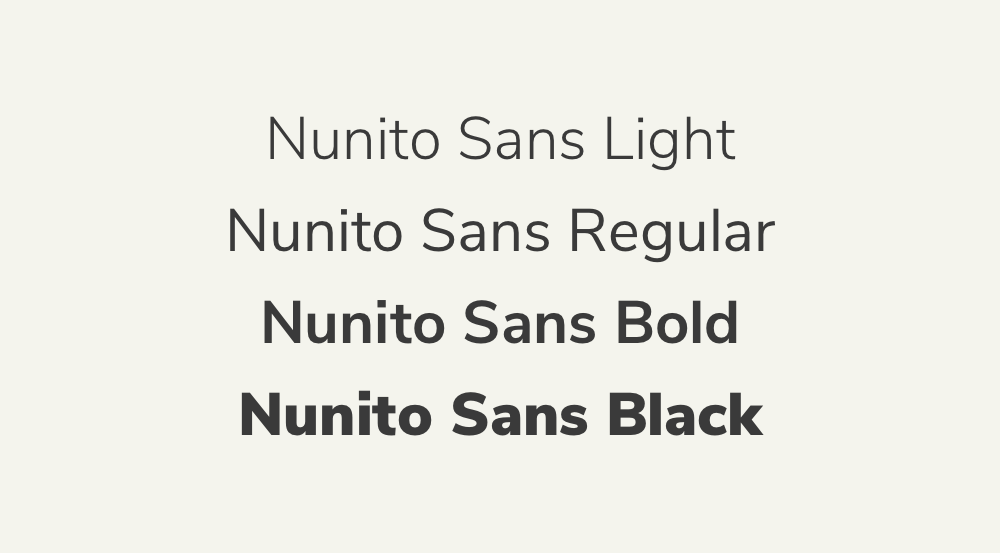
The Nunito Sans font family has a number of weights that allow us to use this single typeface for all of our branded assets by leveraging various sizes and weights to communicate hierarchy and draw attention to items of importance.
Nunito Sans
Hierarchy & Pairings
It is important to maintain these types of pairings to allow for clarity, consistency, and a strong hierarchy for all communications. For headlines and sub-headings, Black weight should be paired with Regular weight, and Bold weight should be paired with Light weight. Body text should always be Light weight.
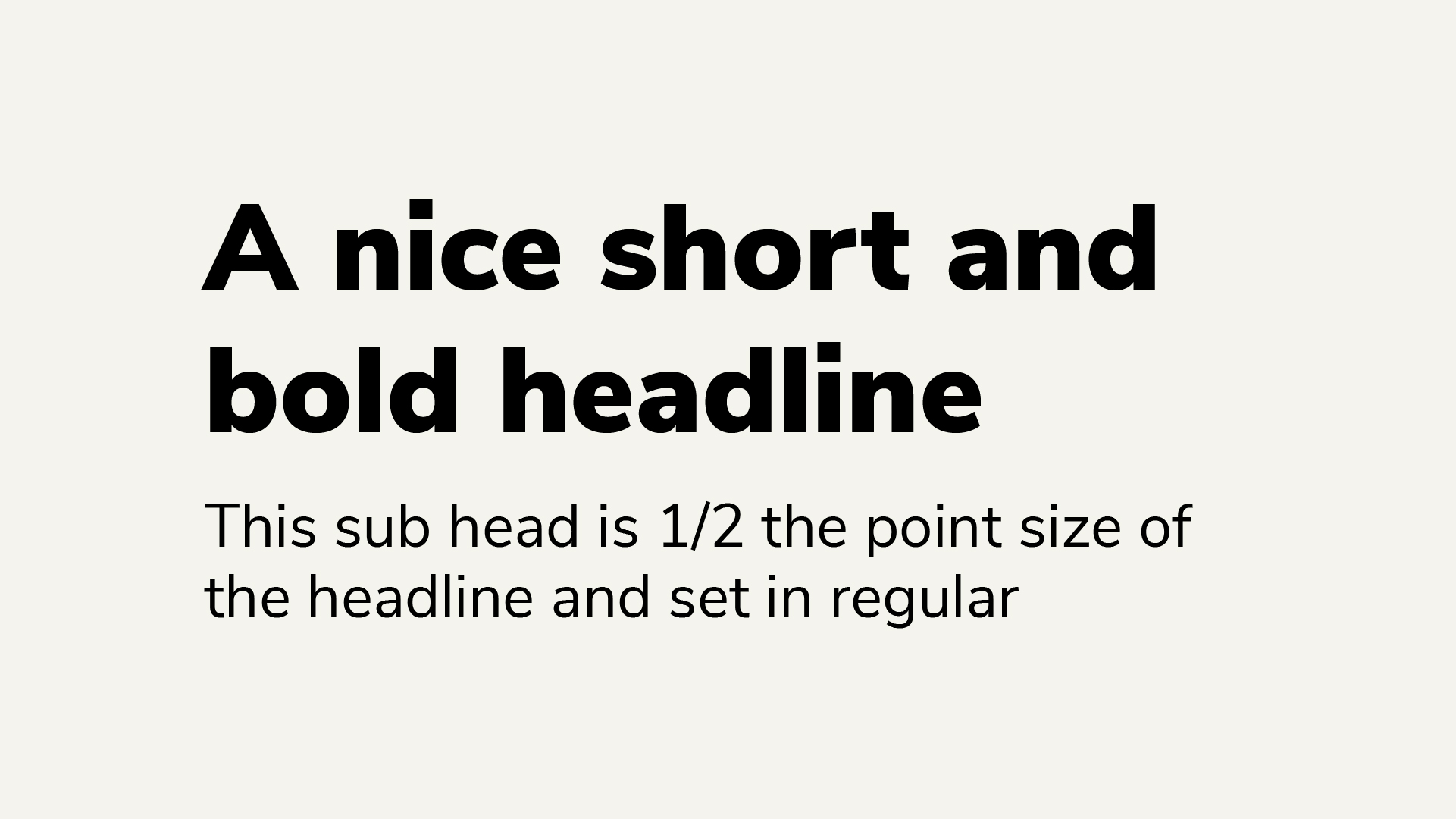
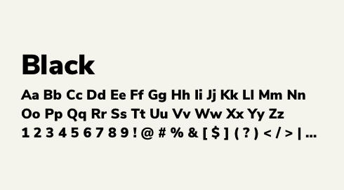
Headline
Nunito Sans Black
1.0/100% leading
0 tracking
6 words or less
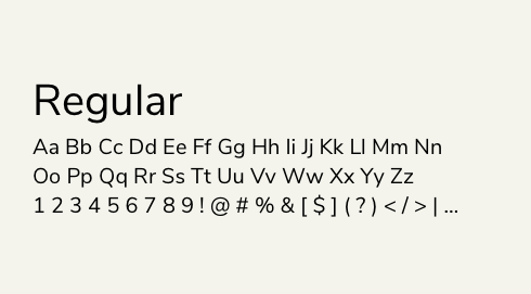
Subhead
Nunito Sans Regular
½ headline point size
1.1/110% leading
0 tracking
Headline
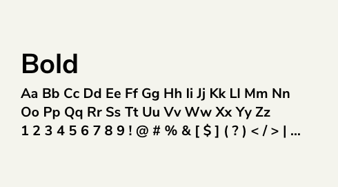
Nunito Sans Bold
1.0/100% leading
0 tracking
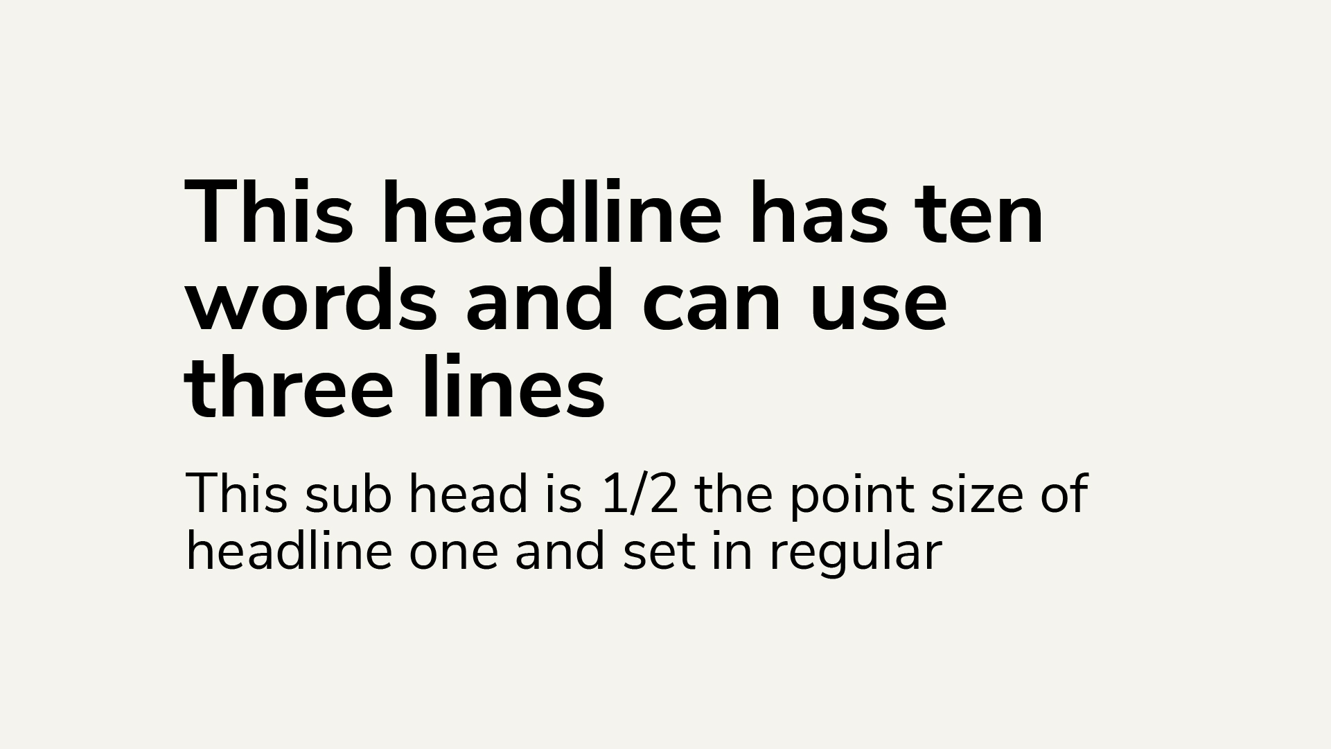
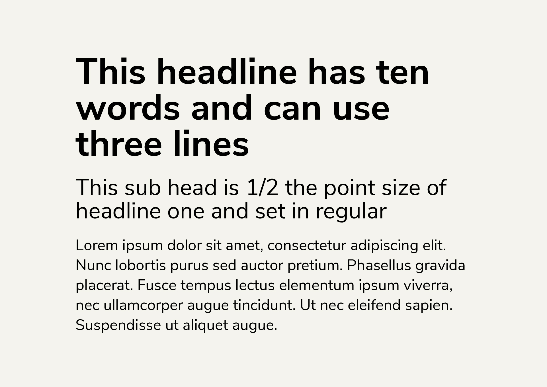
7 words or more
Subhead
Nunito Sans Light
½ headline point size
1.1/110% leading
0 tracking
Headline
Nunito Sans Bold
1.0/100% leading
0 tracking
7 words or more
Subhead
Nunito Sans Light
½ headline point size
1.1/110% leading
0 tracking
Body
Nunito Sans Light
⅓ headline point size
1.25/125% leading
0 tracking
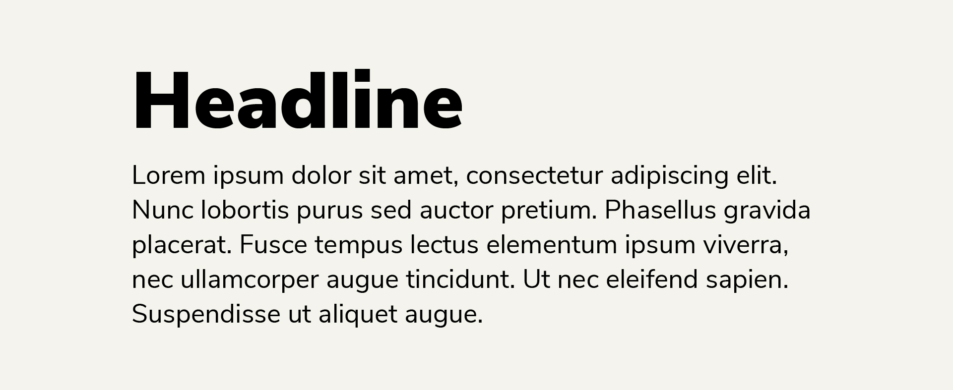
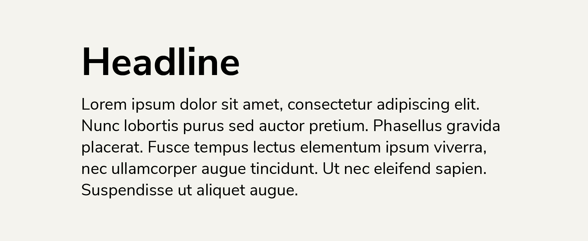
Headline
Nunito Sans Black 100% leading 0 tracking 6 words or less
Body
Nunito Sans Light ⅓ headline point size 1.25/125% leading 0 tracking
Headline
Nunito Sans Bold 100% leading 0 tracking 7 words or more
Body
Nunito Sans Light ½ headline point size 1.25/125% leading 0 tracking
Headline
Nunito Sans Black 100% leading 0 tracking
Body
Nunito Sans Light Same as headline point size 1.25/125% leading 0 tracking
Brand Assets
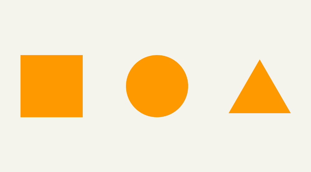
Square, circle, triangle. These three shapes make up the geometric basis of design systems in both science and nature. Our brand utilizes these shapes in enlarged and abstracted ways to create visual interest, depth, and consistency across assets.
In Use
Enlarging these shapes and using the alternate tones of light/dark orange and dark-tan to create a two-toned background is the most basic expression of this visual asset in our branding. Keeping them large and partially obscured off-canvas is key to our aesthetic.


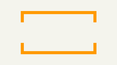
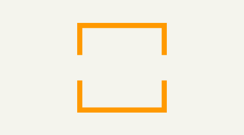
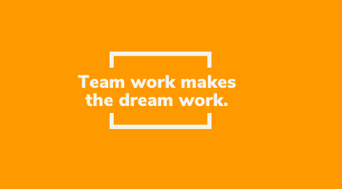
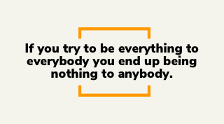
Brackets
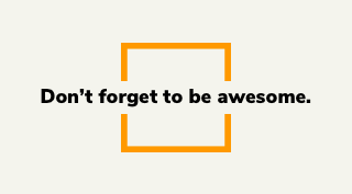
The top and bottom “squared brackets” from our logo can be used to encapsulate headlines or bring attention to a specific word or action-phrase within a headline. The boxed version can be used to highlight a specific aspect of an image or to contain a cropped image.
In Use
Outside the use of our logo, the top and bottom square brackets should only be used in conjunction with text content. The font and weight should always be Nunito Sans Black and the size/proportion of the brackets are relative to the size of the text headline.
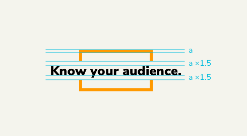
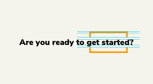
The space above and below the capital letter in the headline should be 2x the size of the horizontal bar of the brackets. The size of the bracket bars should be close to the width of the headline letter stems.
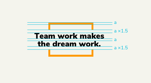
When using a headline that spans over two-lines, the space between the bracket and the headline should stay the same and the space between the two lines should be equal to the bracket bar.
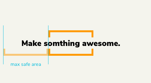
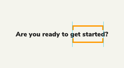
The headline length should never exceed 1x the width of the bracket on each side. Longer headlines should span over two lines.
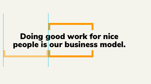
Headlines that span over two-lines should never exceed 1x the width of the bracket on each side.
When emphasizing a specific part of a headline, the space above and below the capital letter should be 2x the size of the horizontal bar on one of the brackets.
When emphasizing a specific part of a headline, the edge of the brackets should closely align with the first and last letter of the headline. Punctuation is not the last letter.
When using this headline style on an orange or other solid colour background, make sure the text and brackets are the same colour.
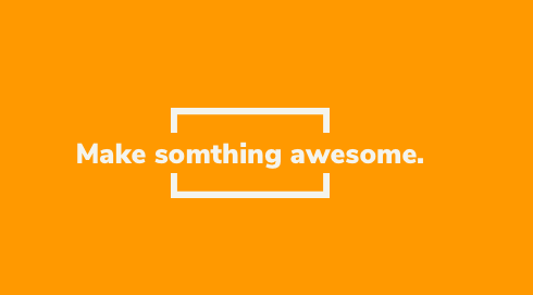
When using this headline style in a single colour always use our brand tan whenever possible and fallback to white if needed.
When using the boxed version of our brackets, always keep it perfectly centred on the asset.

Use the boxed brackets to contain a cropped image and create depth by putting one of the brackets behind the image.

Overlay the boxed brackets on top of an image or screenshot to bring attention or focus to a specific part of the image.
Incorrect Usage
Never use three line of text in a headline with the brackets on the top and bottom.
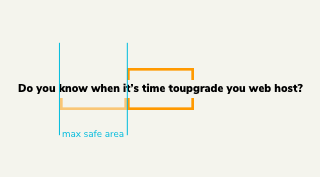
Never let the headline text extend beyond the safe area.
Never use the boxed brackets with a text.
Imagery
Our brand’s imagery is intended to showcase our portfolio, create a visual connection to the work we do and capture the emotion our clients feel when they achieve their goals.
Our brand’s imagery fits into 4 primary categories:
Rendered Mockup (Device + Assets)

Candid Mockup

Background Scene

Client Hero
Device Mockup
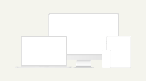
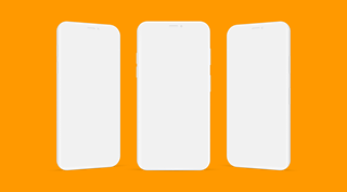
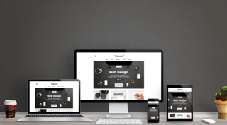
When showcasing our portfolio on an isolated device mockup, always stick to illustrated white versions of the devices. This will add an element of visual consistency across our portfolio assets, it’s more unique than showing a photo-realistic version of the device, and will make these assets more “evergreen” as a specific model of each device is less obvious.


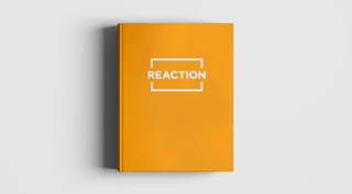
Asset Mockup
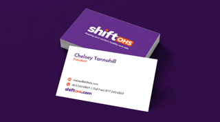
When showcasing non-digital items from our portfolio always use mockups with solid colour or image-based backgrounds that complement the brand or asset. These images should look rendered, 3-dimensional and even somewhat surreal.
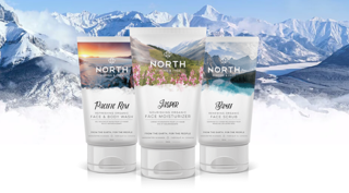
Candid Mockup
Showcasing our portfolio on candid mockups allows us to demonstrate what these assets would look like in the wild. It’s important to select images with natural lighting effects and scenes that represent the real-world environments our clients operate in.


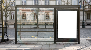


Background Scenes
Background scenes are images with an object or group of objects that have been intentionally set up and include large clear space. These images can have a tendency to look overly-stock and should only be used with a text overlay. The clear space can often be extended to cover any canvas size and bonus points if you can make one of the objects orange.
Client Hero
Images that are meant to represent our clients’ or the industries we serve should feature a “Hero” making eye contact with the camera. The subject(s) should be expressing a positive emotion that reflects how they feel after achieving their goals. This art direction applies to images of our team as well.


Incorrect Usage
Images that are meant to represent our clients’ or the industries we serve should feature a “Hero” making eye contact with the camera. The subject(s) should be expressing a positive emotion that reflects how they feel after achieving their goals. This art direction applies to images of our team as well.

Never use close up images of a device with an asset that you can’t clearly see.

Never use images that appear overly-stock and are ambiguous to what the subject is doing.

Never use a busy image with no face, asset mockup, and no clear space for text.

Never use an asset where the subject is not making eye contact.

Never use wide shots with no hero or eye contact.

Never use images of people cropped on a white background.

Never use images of people cropped on a white background.

Never use photo-realistic devices to show isolated portfolio mockups.
Icons
Square, circle, triangle. These three shapes make up the geometric basis of design systems in both science and nature. Our brand utilizes these shapes in enlarged and abstracted ways to create visual interest, depth, and consistency across assets.